| Southern Utah-based film photographer, Kelsea Callister, is back to discuss her photographic style and how to develop your own style. She discusses keeping an eye out for color, composition, light, effects, and mediums to better understand the photos that inspire you. As you develop a greater understanding of your taste and continue making photos with these elements in mind, you’re bound to hone your style with time. Kelsea also highlights GelForm as a stepping stone to developing your style and finding a look that suits your photography. |
SECTION 1: DEVELOPING YOUR STYLE
Developing a style as a photographer can take a lot of time and be a confusing process. I remember when I just started out as a photographer, I knew that there were lots of different types of photos, compositions, and editing styles I loved but I really couldn’t pinpoint exactly what would make my own work unique. I had whole pinterest boards of inspiration but it just seemed like my own work was lacking in so many ways. I felt like my work was generic. Looking back now, there is some advice I wish I had followed when starting out this process and I’m going to give you all the tips I wish I knew in this blog post. (And keep in mind that finding your style will take time, I don’t feel like my style was fully developed until about 2 years in and even then it still changes every now and then)
ANALYZE PHOTOS & CREATE A MASTER LIST
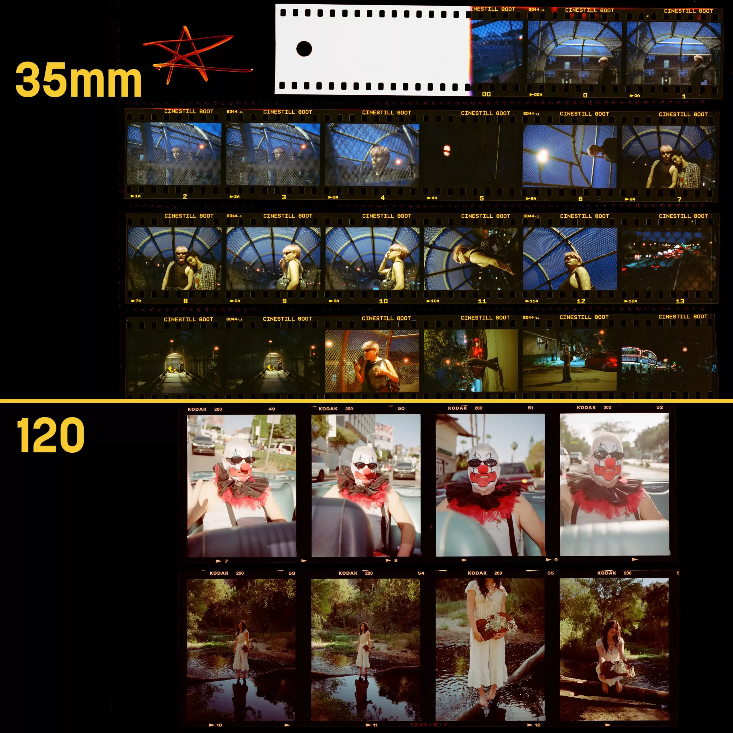
This was one of the best things I did to help fine tune my style. I saved so many pictures as inspiration and really had a hard time actually incorporating elements I liked into my own work. Once I actually analyzed photos and made this list, that all changed and I felt like I was able to take actionable steps to improve my photography. There are 4 elements that you will want to pay close attention to when analyzing photos you love. Colors, light, effects, and composition. Here’s how you can get started with this!
Step 1: SAVE LOTS OF PHOTOS
Save every photo that speaks to you and has elements you like. Create Pinterest boards or saved folders on Instagram. Compile a decent collection of these images to reference.
Step 2: COLORS
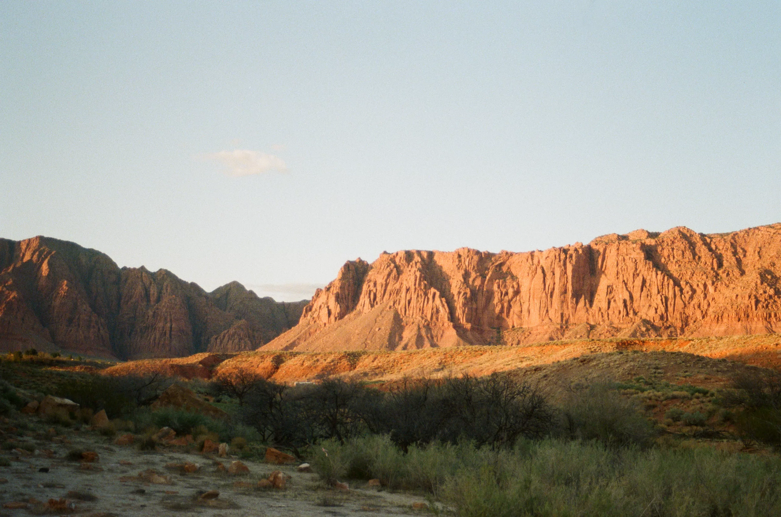
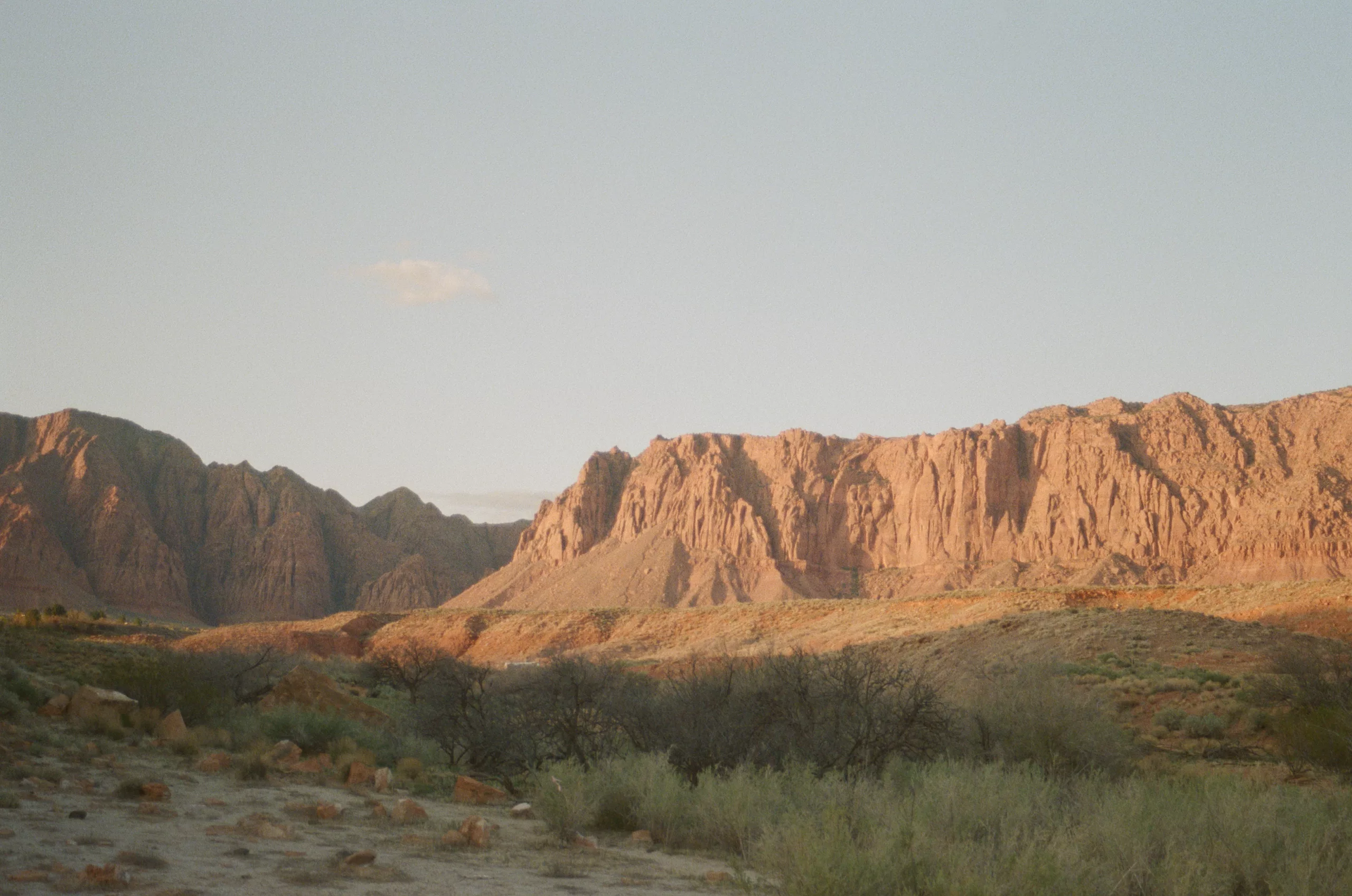
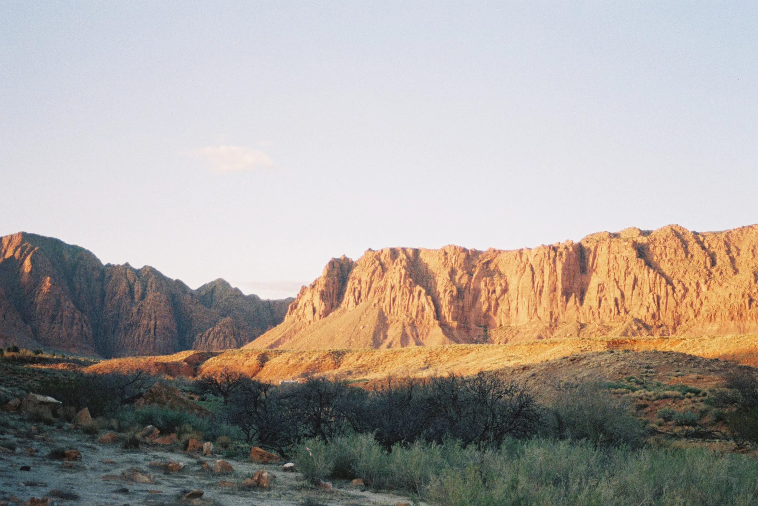
Here’s where you are going to have to start paying close attention to these pictures. You are going to go in and analyze each one of these colors in the images you’ve saved. Do you notice any patterns throughout your collection? Do you find that you like deep greens or golden yellows? Or do you find yourself drawn to images with turquoise blue waters, or bright orange desert sunsets? Write down what you like about each color specifically. Here’s an example of what I wrote down when I did this list years ago:
RED: subtle desert red hues
ORANGE: slightly yellow orange sunlight
YELLOW: muted yellow sunlight
GREEN: dark deep greens
BLUE: cyan atmospheric haze, deep blue mountain shadows
VIOLET: deep sunset violet hues
My style has changed even just since I wrote this down back then, since I now prefer more vibrant reds and oranges then I used to, but this really helped me get started in figuring out the colors I wanted in my own work.
Step 3: LIGHT
Now it’s time to analyze the type of light/exposure you like in the images you saved. Do you find yourself liking really bright and vibrant images, or more dark and moody images? Do you like low light, dusk, and night images, or do you like golden, bright, sunlight filled images? Or do you lie somewhere in between? What time of the day are the photos taken? Do you like bright highlights or prefer your highlights to be more muted? Here’s what I had written down from my list:
EXPOSURE: darker images, lower exposure
SHADOWS: dark shadows during sunsets, lighter shadows in low light
HIGHLIGHTS: muted highlights
CONTRAST: low contrast
WHITES: muted white tones
TIME OF DAY: golden sunsets, astrophotography, morning sun rays
It’s interesting to look back on my own list since some of these preferences have stayed exactly the same and some have evolved over time. I no longer prefer dark shadows in almost any image I shoot and prefer to lighten my shadows quite a bit, but I still love the look of muted highlights.
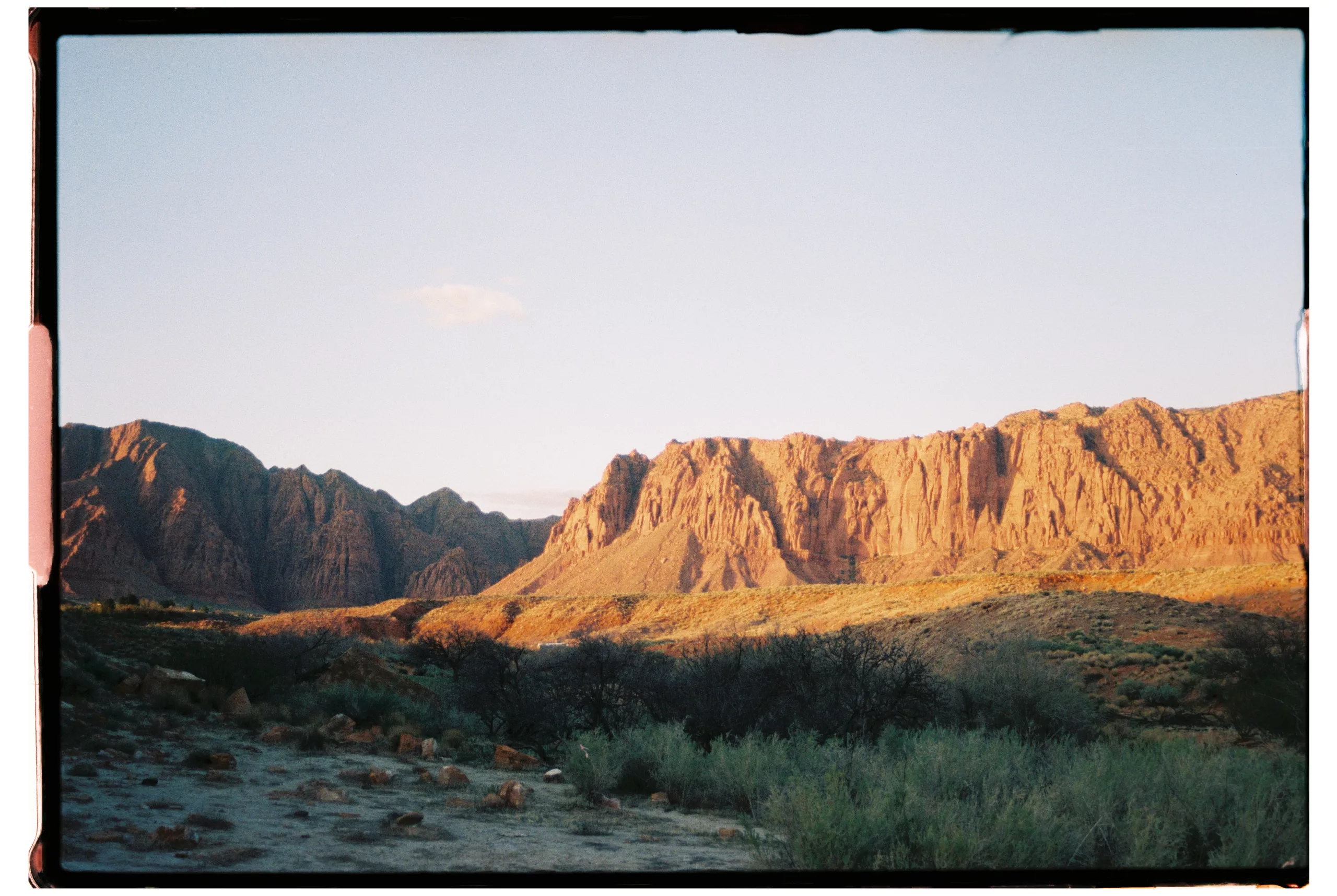
Step 4: EFFECTS + MEDIUMS
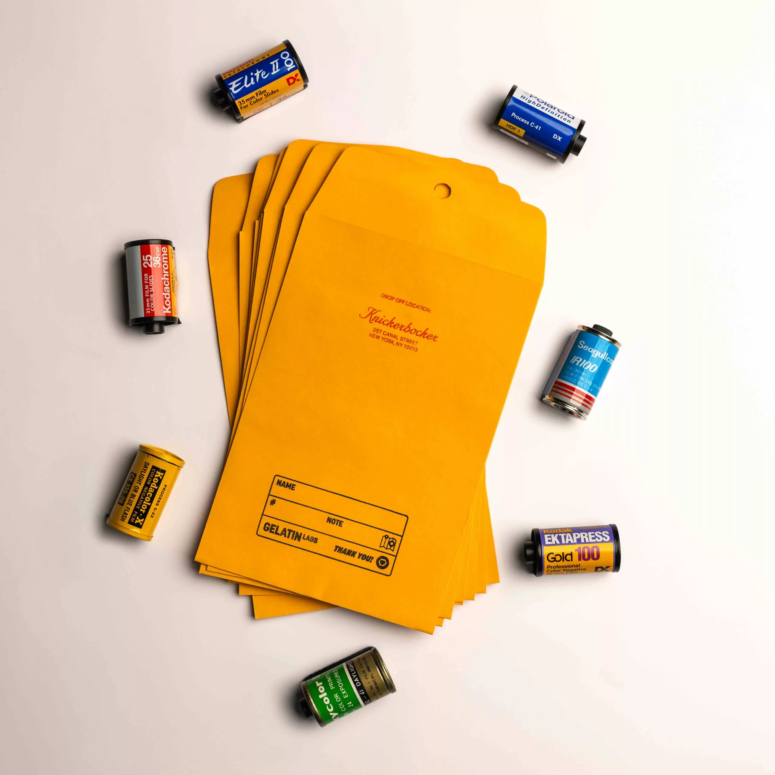
Look for any effects that add unique qualities to the photos you’ve saved. Examples of this include grain, film borders, vignettes, Also keep in mind which mediums you seem to gravitate towards. Mostly digital? 35mm film? Here’s my examples:
GRAIN: medium to heavy/film like
MEDIUMS: 35mm film and polaroids
TYPE OF FILM: b&w film, hazy/dreamy film
I actually never shoot b&w film since I did that a few times and was just so sad not to have any color, and I still mostly shoot 35mm film for all my personal work so that hasn’t changed! Most of these preferences have stuck with me.
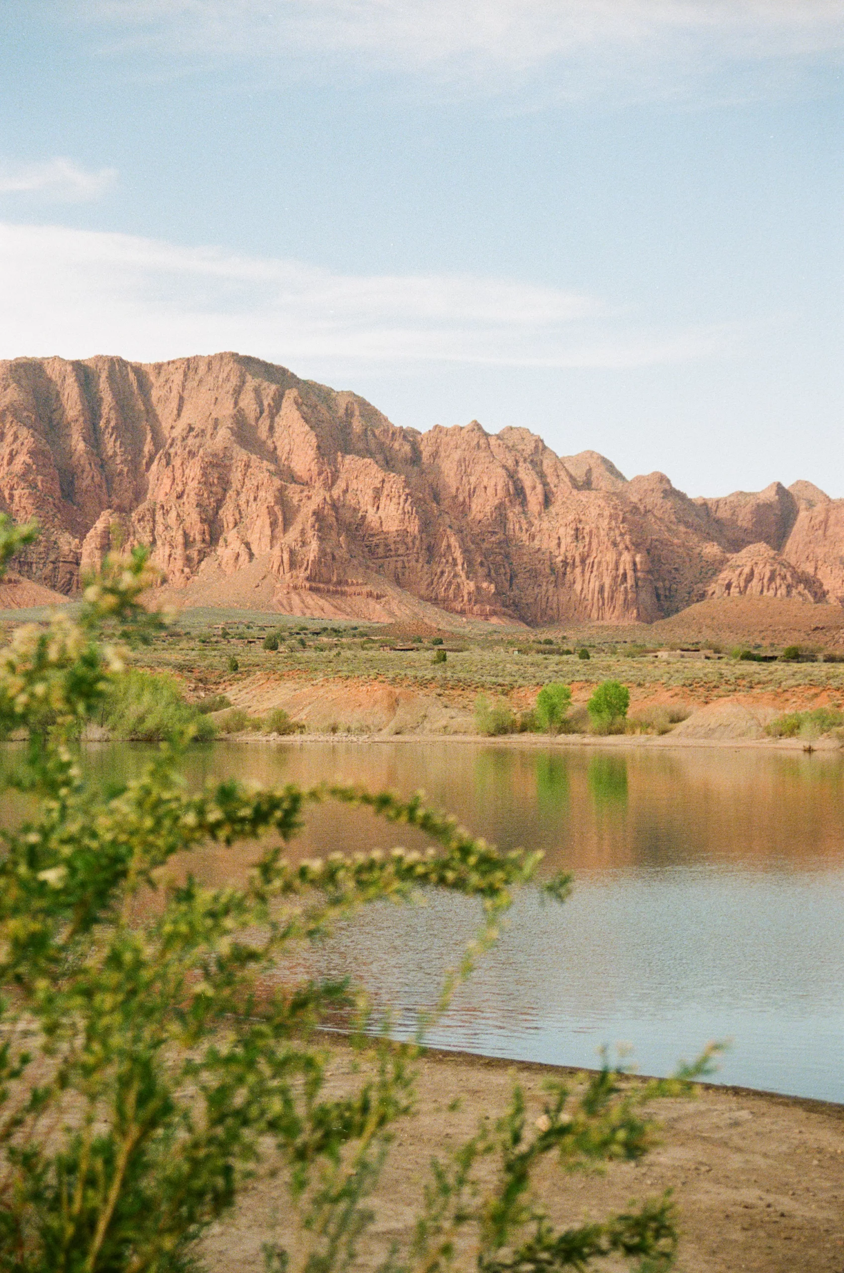
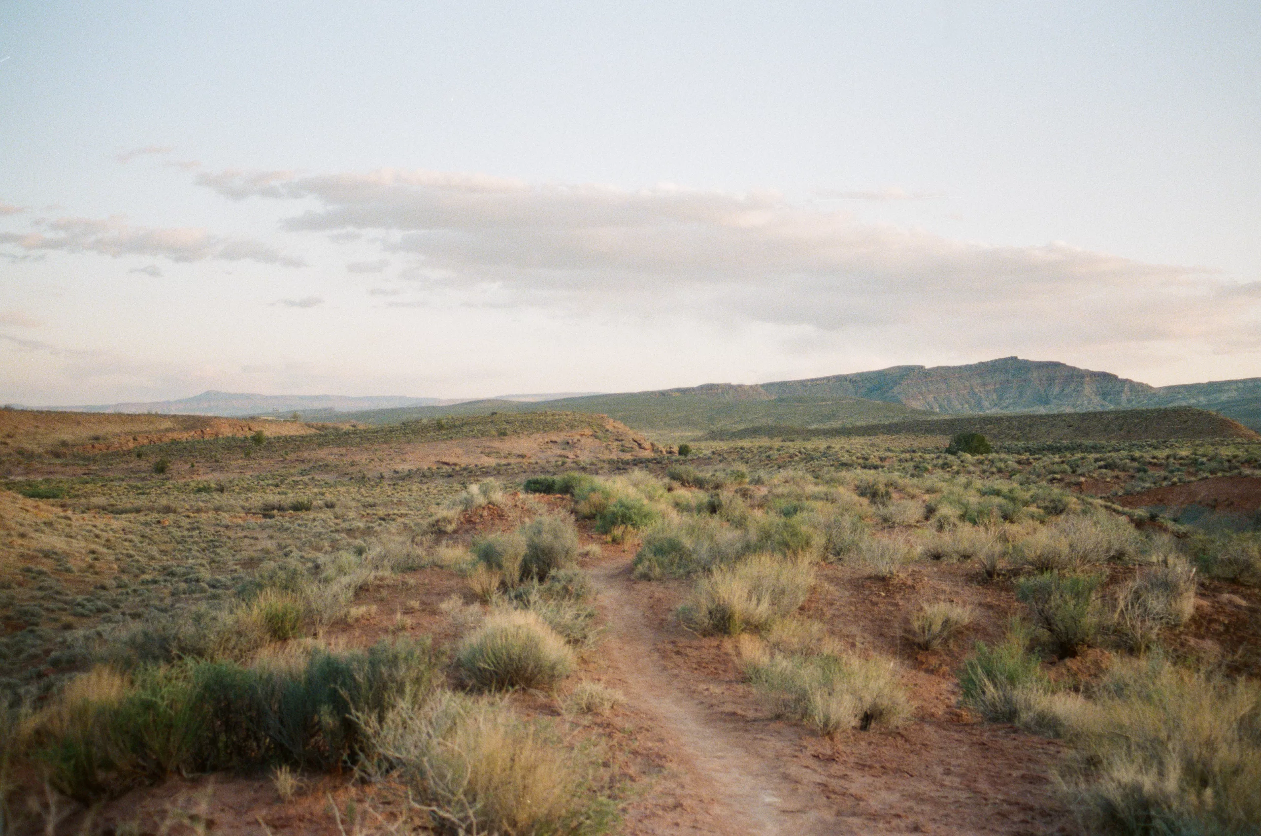
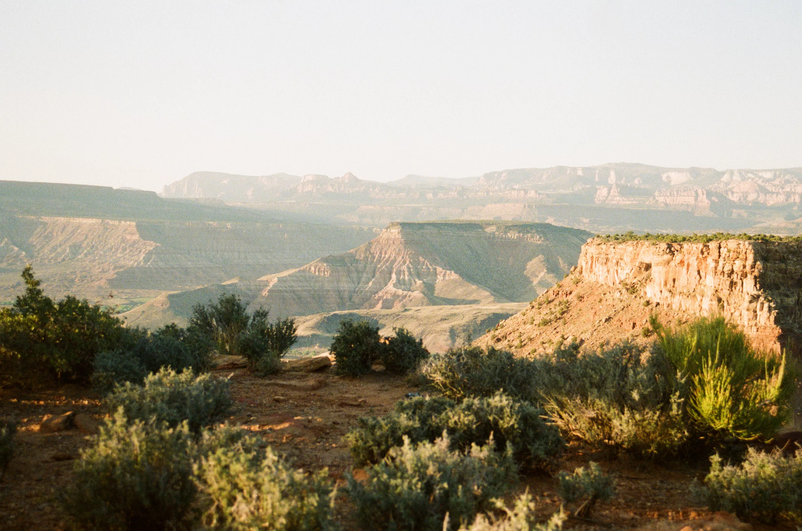
Step 5: COMPOSITION
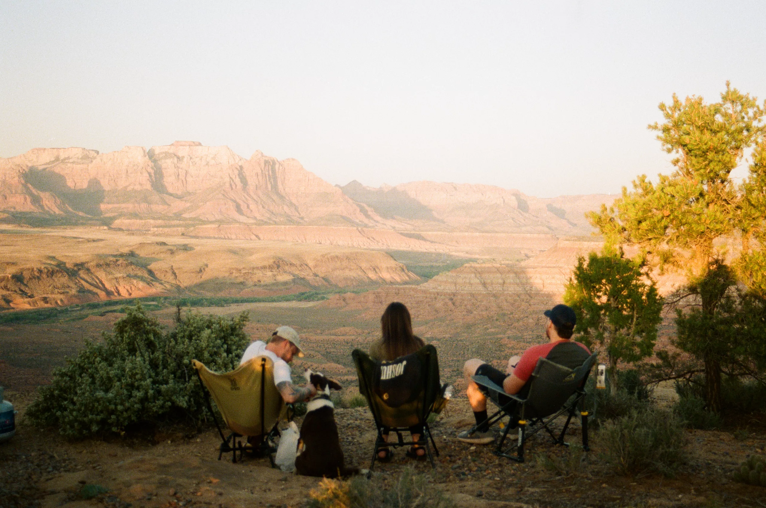
It’s important to consider how you like images to be composed. Composition can really separate your style from other photographers. Even though millions have visited Zion National Park, and so many photos have been taken there, with the right eye and composition, you can create images that no one has ever seen before, even from really popular locations. Here is what I had written down for the images I had saved years ago:
- big landscapes, little people
- big smiles
- driving in the car
- exploring
- photographing people’s hobbies
- stunning portraits
I have always loved big landscapes, little people shots, that has never changed. However I don’t love portraits as much as I used to. I have a lot of new composition ideas in my head now but these were a great start for me in the beginning.
IMPLEMENTATION
Now that you’ve analyzed everything you like about other people’s photos, it’s time to implement these into your own work. You can start by focusing on one section at a time. Just focus on learning how to shoot film if you like the look of it, or just practice composing your images in different ways. Over time you will start really finding your style and eventually you will be inspired by your own work which is a great feeling!
SECTION 2: GELFORM
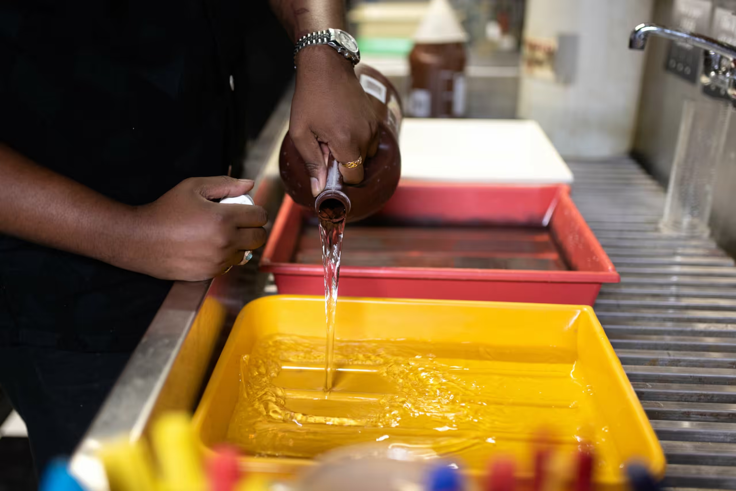
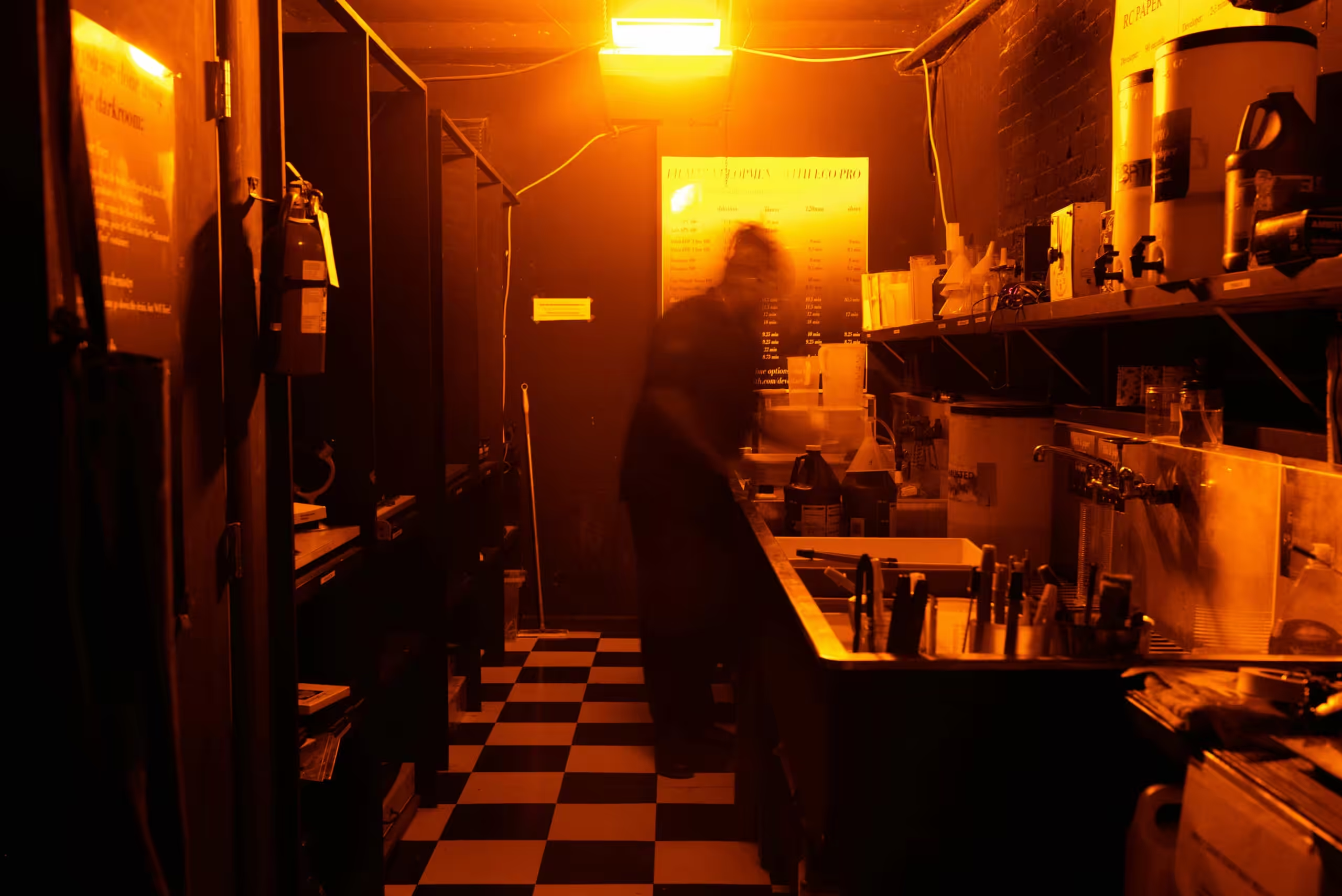
Gelatin Labs has really put in a lot of work to help photographers fine tune their style when it comes to film scans. I’ve always loved this about them. My scans are so easy to edit and I have so much control over them. Since my own style is well developed, I like to use their flat scan option which allows me to have the most control over the final outcome of my images. Recently they’ve come out with GelForm, a new way of controlling the final output of your scans, and they have some really great options that fit a lot of different preferences! So I wanted to talk about this specifically since this will be important for finding your style as a film photographer.
Gelatin Labs wrote a whole article about how this all works (click here to read that blog post) but to summarize it in their words, here’s an introduction to GelForm.
“When we first launched Gelatin Labs, we offered a minimal, neutral Flat TIFF that gave photographers as much editing leeway as possible—letting them reshape contrast and color later on. As our community grew, it became clear that while some folks loved fine-tuning every detail, others preferred a more direct, ready-to-go look. That’s why we introduced Contrast & Temperature choices, such as Punchy vs. Flat, Warm vs. Cool. But the more we refined our scanners and studied film stocks, the more we realized these dual sliders weren’t always intuitive—or guaranteed to bring out each roll’s potential. So, we went back to the drawing board, spent a year calibrating every scanner in our lineup, and arrived at GelForm: a family of meticulously crafted “formulas” that preserve the freedom of customization while simplifying your choices.”
So basically you have the ability to control whether you want your film to be already edited and ready to go, or if you want to control all the editing yourself. Here are the options they’re offering currently!
The Standard
This is a great option for an image to look true-to-film, not too warm, too cool, or too much or too little contrast. This is probably the best option for most people since you still have control over the editing but you could also get this scan and post it right away without having to fine tune anything.
The Hi-C
This is like the standard option but with a higher contrast. Makes it feel less faded and is more punchy.
The Hi-C, Spiked
Similar to The Hi-C but warmer, if you prefer warmer colors in your image.
The Flat Earth
Their classic, baseline TIFF scan with minimal processing. This is the option I use since I have full control over every aspect of how my edits turn out. If you want to apply heavy edits this is a great option but if you want to get your scan and post it right away I wouldn’t recommend this option since it’s very flat.
The Palm-Aire
I love this one. It creates a more vintage, nostalgic look for the image.
The Fringe
Cooler tones with a border! I’ve been loving borders lately so this is a cool option.
The Spacely
Full sprocket scanning if you want your image bordered with the entire 35mm frame.
By discovering your own style, you can find which GelForm works the best for you! If you’re not sure, you can go with the standard option and go from there! I’d recommend trying out a few different GelForms to see what you like, and maybe you’ll find yourself loving the film borders or the higher contrast looks!
Also just a side note, not a lot of people know that you can even edit film. I LOVE editing film and it really helps my work stick out. Some people prefer not to touch the film and let it do it’s thing, but I personally love editing my film scans just as much as my own digital photos!
Keep working on developing your style, have patience, and you’ll see your style improve a lot over time!
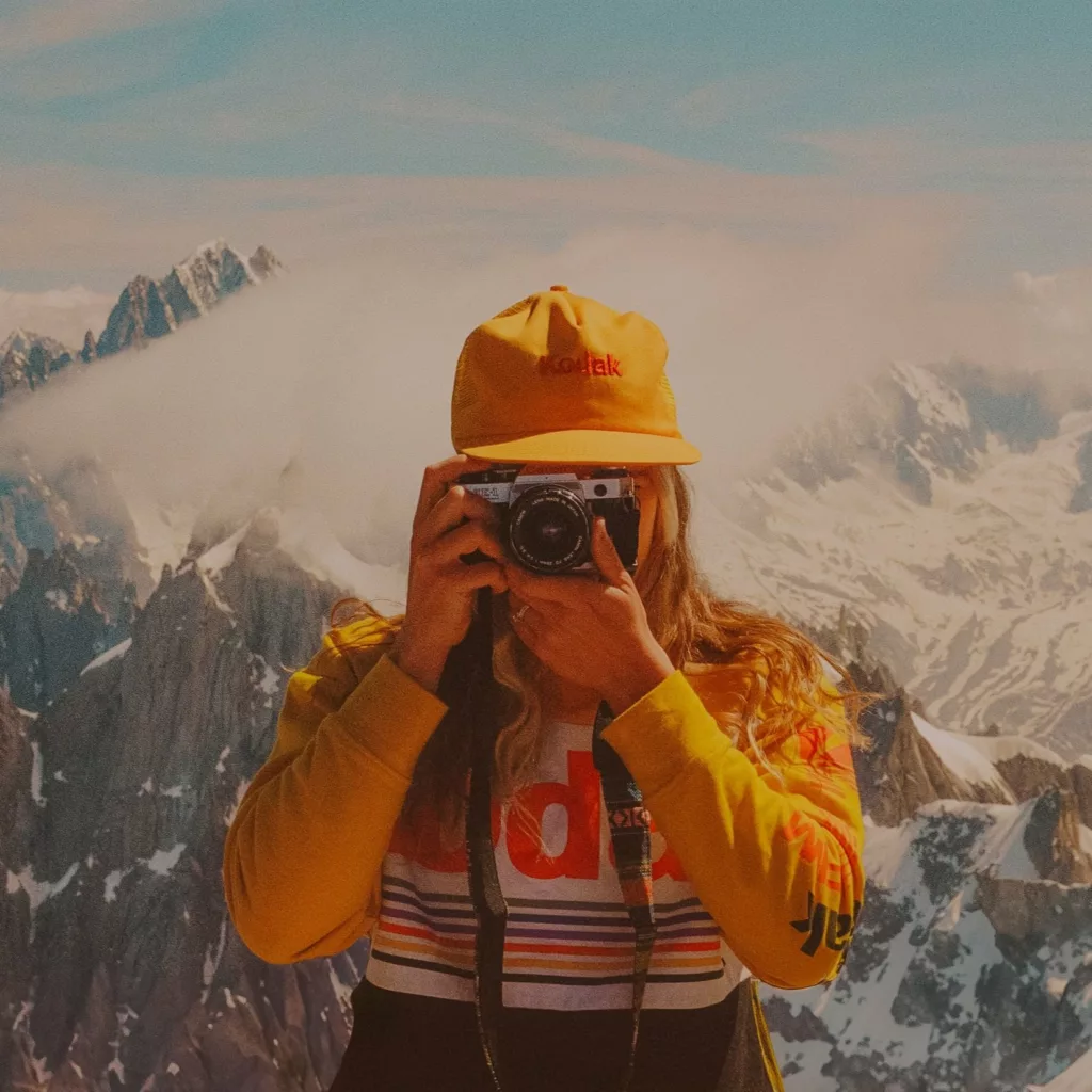
Hi! My name is Kelsea Callister and I’ve been a film photographer since 2021.
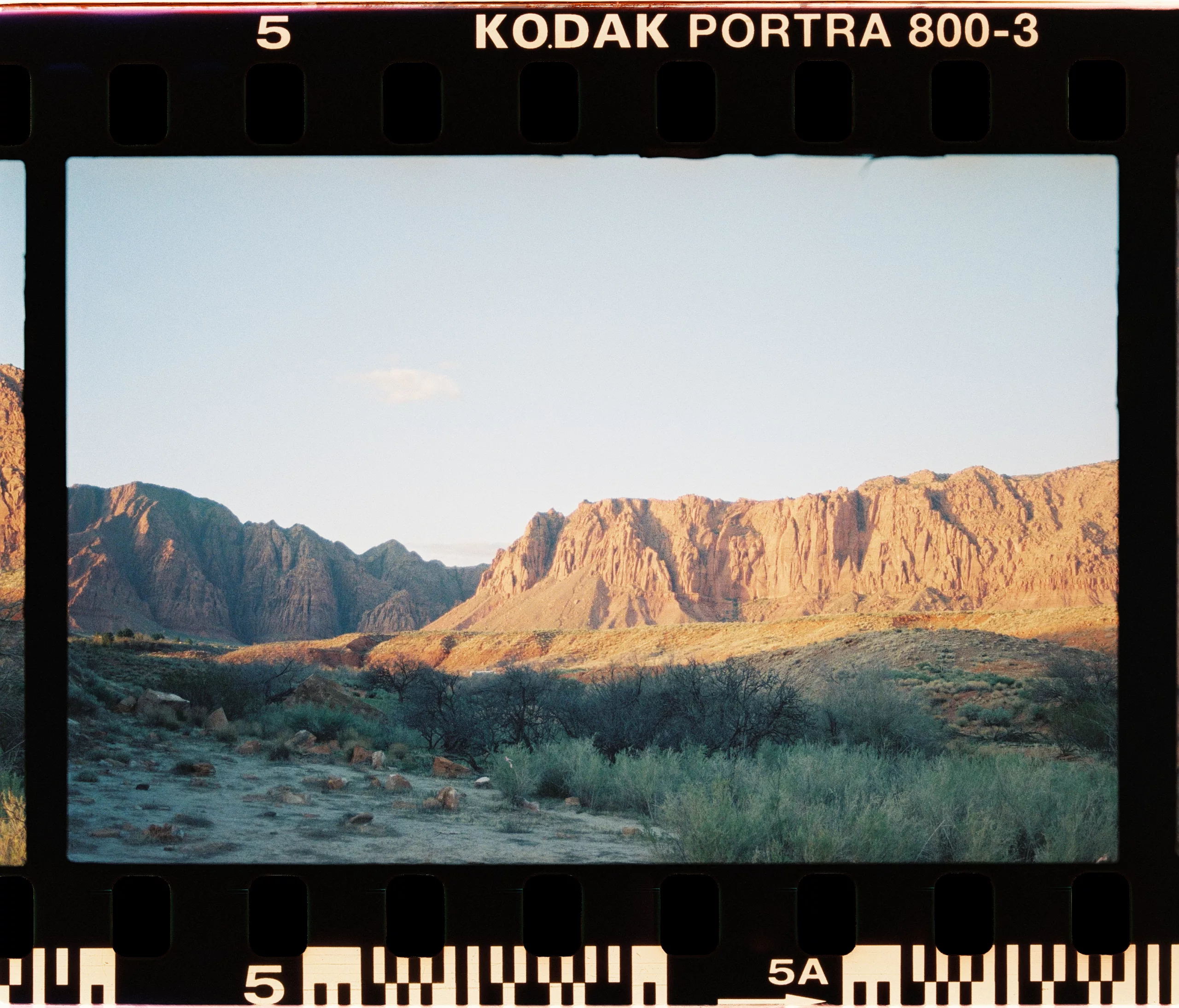
I shoot only film for all my personal work now and shoot a combination of film and digital for my elopement photography business. I adore the look and feel of film and I currently have 3 Canon AE-1’s and shoot almost exclusively Portra 800 (I know I need to branch out more but the grain and low light performance is just too good).
%22%3E%3Cpath%20d%3D%22M500%2C930c-44.5%2C0-87.9%2C5.9-130.2%2C17.6c-42.3%2C11.7-81.3%2C28.1-117.2%2C49.2c-35.9%2C21.1-68.9%2C46.7-99%2C76.8c-30.1%2C30.1-55.7%2C63.1-76.8%2C99c-21.1%2C35.9-37.5%2C74.9-49.2%2C117.2C15.9%2C1332.1%2C10%2C1375.5%2C10%2C1420c0%2C44.5%2C5.9%2C87.9%2C17.6%2C130.2s28.1%2C81.3%2C49.2%2C117.2c21.1%2C35.9%2C46.7%2C68.9%2C76.8%2C99c30.1%2C30.1%2C63.1%2C55.7%2C99%2C76.8c35.9%2C21.1%2C74.9%2C37.5%2C117.2%2C49.2c42.3%2C11.7%2C85.7%2C17.6%2C130.2%2C17.6c44.5%2C0%2C87.9-5.9%2C130.2-17.6c42.3-11.7%2C81.3-28.1%2C117.2-49.2c35.9-21.1%2C68.9-46.7%2C99-76.8c30.1-30.1%2C55.7-63.1%2C76.8-99s37.5-74.9%2C49.2-117.2c11.7-42.3%2C17.6-85.7%2C17.6-130.2c0-33.3-3.3-66.2-10-98.6c-6.7-32.4-16.1-63.1-28.4-92.2c-12.3-29.1-27.3-56.8-45.2-83.2c-17.9-26.4-37.8-50.6-59.8-72.6s-46.2-41.9-72.6-59.8c-26.4-17.9-54.1-32.9-83.2-45.2c-29.1-12.3-59.8-21.7-92.2-28.4C566.2%2C933.3%2C533.3%2C930%2C500%2C930z%20M450%2C1320h102.4c1.9%2C0%2C3.5%2C0.4%2C5%2C1.2s2.7%2C2%2C3.6%2C3.6c0.9%2C1.6%2C1.4%2C3.2%2C1.4%2C4.8c0.8%2C25.1%2C4.7%2C44.3%2C11.8%2C57.8c7.1%2C13.5%2C20.3%2C26.6%2C39.8%2C39.4c10.9%2C6.9%2C19.3%2C12.4%2C25.2%2C16.4c5.9%2C4%2C12%2C8.9%2C18.4%2C14.6c6.4%2C5.7%2C11.1%2C11%2C14%2C15.8c2.9%2C4.8%2C5.7%2C10.9%2C8.4%2C18.2c2.7%2C7.3%2C4.4%2C15.3%2C5.2%2C24c0.8%2C8.7%2C1.2%2C19%2C1.2%2C31c0%2C14.9-1.9%2C28.9-5.6%2C42c-3.7%2C13.1-8.9%2C24.8-15.4%2C35.2c-6.5%2C10.4-14.4%2C19.9-23.6%2C28.4c-9.2%2C8.5-19.3%2C15.8-30.2%2C21.8s-22.5%2C11.1-34.6%2C15.2s-24.5%2C7.2-37.2%2C9.2c-12.7%2C2-25.5%2C3-38.6%2C3c-58.7%2C0-104.9-14.9-138.8-44.8c-33.9-29.9-52.1-72-54.8-126.4v-0.4c0-2.7%2C0.9-4.9%2C2.8-6.8c1.9-2.1%2C4.3-3.2%2C7.2-3.2h107.6c1.1%2C0%2C2.1%2C0.1%2C3.2%2C0.4c1.1%2C0.3%2C2%2C0.7%2C2.8%2C1.4c0.8%2C0.7%2C1.5%2C1.3%2C2%2C2s1%2C1.5%2C1.4%2C2.6c0.4%2C1.1%2C0.6%2C2.1%2C0.6%2C3.2c1.1%2C19.5%2C7.2%2C34.3%2C18.4%2C44.4c11.2%2C10.1%2C27.1%2C15.2%2C47.6%2C15.2c14.4%2C0%2C26.1-4.3%2C35.2-12.8c9.1-8.5%2C13.6-19.3%2C13.6-32.4c0-20.8-13.1-40.1-39.2-58c-47.2-34.4-70.8-72.8-70.8-115.2V1330c0-1.3%2C1.3-3.3%2C4-6S448.7%2C1320%2C450%2C1320z%20M440%2C1100h122c5.3%2C0%2C10%2C1.9%2C14%2C5.8c4%2C3.9%2C6%2C8.6%2C6%2C14.2v120c0%2C5.6-2%2C10.3-6%2C14.2c-4%2C3.9-8.7%2C5.8-14%2C5.8H440c-5.6%2C0-10.3-1.9-14.2-5.8c-3.9-3.9-5.8-8.6-5.8-14.2v-120c0-5.6%2C1.9-10.3%2C5.8-14.2C429.7%2C1101.9%2C434.4%2C1100%2C440%2C1100z%22%2F%3E%3C%2Fg%3E%3C%2Fg%3E%0A%09%3C%2Fsvg%3E%0A)